
Nút Liên Hệ Đẹp Trên Website: Nâng Tầm Trải Nghiệm Người Dùng
Trong thế giới kỹ thuật số ngày nay, một website không chỉ là nơi cung cấp thông tin mà còn là công cụ tương tác mạnh mẽ giữa doanh nghiệp và khách hàng. Một trong những yếu tố quan trọng góp phần tạo nên trải nghiệm người dùng liền mạch và chuyên nghiệp chính là nút liên hệ. Không chỉ đơn thuần là một liên kết, một nút liên hệ được thiết kế đẹp mắt và hoạt động hiệu quả có thể khuyến khích khách hàng tiềm năng hành động, từ đó tăng cường chuyển đổi cho website của bạn.
Tại Sao Nút Liên Hệ Lại Quan Trọng?
- Tăng Cường Tương Tác: Một nút liên hệ dễ nhìn, dễ tiếp cận sẽ khuyến khích người dùng liên hệ khi họ có thắc mắc hoặc muốn tìm hiểu thêm về sản phẩm/dịch vụ của bạn.
- Cải Thiện Trải Nghiệm Người Dùng (UX): Nút liên hệ được thiết kế tốt giúp người dùng tìm thấy thông tin họ cần một cách nhanh chóng, tạo cảm giác chuyên nghiệp và đáng tin cậy.
- Thúc Đẩy Chuyển Đổi: Khi người dùng dễ dàng liên hệ, khả năng họ trở thành khách hàng sẽ cao hơn, dù là qua form điền, số điện thoại, hay chat trực tuyến.
- Phản Ánh Thương Hiệu: Thiết kế của nút liên hệ cũng góp phần thể hiện phong cách và nhận diện thương hiệu của bạn.
Các Mẫu Nút Liên Hệ Đẹp và Phổ Biến
Dưới đây là một số mẫu nút liên hệ đẹp và hiệu quả, kèm theo mã nguồn HTML và CSS để bạn có thể dễ dàng áp dụng cho website của mình.
Đây là kiểu nút phổ biến và dễ triển khai nhất, phù hợp với mọi loại website.
HTML:
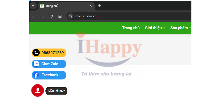
<div id="hotline-btn" class="hotline-fixed" title="Liên hệ ngay"><span class="title-popover"><div class="arrow"></div>Liên hệ ngay</span><i class="icon-user" aria-hidden="true"></i><div class="hotline-fixed--group show"><div class="fixed-btn fixed-btn-sm"><a target="_blank" href="tel: 0988897680"><div class="support-icon nt-rotate"><i class="icon-phone" aria-hidden="true"></i> </div> <span>0988897680</span> </a></div><div class="fixed-btn fixed-btn-sm support-btn--zalo"><a target="_blank" href="//zalo.me/0988897680"> <img class="support-icon--img nt-rotate" src="https://upload.wikimedia.org/wikipedia/commons/9/91/Zalo_Icon.svg" alt=""> <span>Chat Zalo</span> </a></div><div class="fixed-btn fixed-btn-sm support-btn--zalo"><a target="_blank" href="//m.me/kinhbacweb"> <img class="support-icon--img nt-rotate" src="https://upload.wikimedia.org/wikipedia/commons/b/be/Facebook_Messenger_logo_2020.svg" alt=""> <span>Facebook</span> </a></div></div></div>
CSS:
.hotline-fixed {position: fixed;z-index: 1020;left: 30px;bottom: 30px;background: #d10a00;width: 50px;height: 50px;border-radius: 999px;font-size: 1.7rem;color: #ffffff;padding: 0;display: -webkit-box;display: -ms-flexbox;display: flex;-webkit-box-pack: center;-ms-flex-pack: center;justify-content: center;-webkit-box-align: center;-ms-flex-align: center;align-items: center;-webkit-transition: color .15s ease-in-out, background-color .15s ease-in-out, border-color .15s ease-in-out, -webkit-box-shadow .15s ease-in-out;transition: color .15s ease-in-out, background-color .15s ease-in-out, border-color .15s ease-in-out, -webkit-box-shadow .15s ease-in-out;transition: color .15s ease-in-out, background-color .15s ease-in-out, border-color .15s ease-in-out, box-shadow .15s ease-in-out;transition: color .15s ease-in-out, background-color .15s ease-in-out, border-color .15s ease-in-out, box-shadow .15s ease-in-out, -webkit-box-shadow .15s ease-in-out;}.title-popover {width: 84px;height: 30px;background: #2f2b2b;position: absolute;font-size: 12px;left: 60px;display: flex;align-items: center;justify-content: center;bottom: 8px;border-radius: 5px;top: unset;text-align: center;z-index: -1;}.title-popover .arrow {position: absolute;display: block;left: calc((6px + -1px) * -1);width: 6px;height: 12px;margin: .3rem 0;top: 4px;}.hotline-fixed--group {position: absolute;bottom: 60px;left: 0px;display: block;z-index: 1020;opacity: 0;visibility: hidden;-webkit-transition: all 0.3s ease;transition: all 0.3s ease;}.fixed-btn {min-width: 160px;max-width: 180px;background: #FFC107;position: fixed;left: 10px;bottom: 10px;color: #fff !important;font-size: 16px;font-weight: bold;border-radius: 999px;padding: 8px 8px 8px 44px;display: block;margin: 0 auto;}.fixed-btn a {color: #252525;text-decoration: none;}.hotline-fixed--group .fixed-btn-sm {position: relative;left: auto;bottom: auto;padding: 5px 10px 5px 40px;min-width: auto;margin-top: 10px;}.nt-rotate {-webkit-animation: Rotate 1.3s linear 1.3s 5;animation: Rotate 1.3s linear 1.3s 5;-webkit-animation-iteration-count: 5;animation-iteration-count: 5;animation-iteration-count: infinite;-webkit-animation-iteration-count: infinite;-moz-animation-iteration-count: infinite;-o-animation-iteration-count: infinite;}.hotline-fixed--group .fixed-btn-sm .support-icon {position: absolute;border: 1px solid #000;width: 30px;height: 30px;position: absolute;border-radius: 50px;left: 3px;top: 2px;background: #000;color: #fff;display: -webkit-box;display: -ms-flexbox;display: flex;-webkit-box-pack: center;-ms-flex-pack: center;justify-content: center;-webkit-box-align: center;-ms-flex-align: center;align-items: center;font-size: 14px;}.hotline-fixed:after {position: absolute;top: 0;left: -1px;width: 50px;height: 50px;border: 4px solid #cd1818;content: '';border-radius: 50%;-webkit-transform: scale(0.9);transform: scale(0.9);z-index: -1;-webkit-animation: ripple 2s ease-out infinite;animation: ripple 2s ease-out infinite;}.hotline-fixed--group {position: absolute;bottom: 60px;left: 0px;display: block;z-index: 1020;opacity: 0;visibility: hidden;-webkit-transition: all 0.3s ease;transition: all 0.3s ease; }.hotline-fixed--group .fixed-btn-sm {position: relative;left: auto;bottom: auto;padding: 5px 10px 5px 40px;min-width: auto;margin-top: 10px; }.hotline-fixed--group .fixed-btn-sm .support-icon {position: absolute;border: 1px solid #000;width: 30px;height: 30px;position: absolute;border-radius: 50px;left: 3px;top: 2px;background: #000;color: #fff;display: -webkit-box;display: -ms-flexbox;display: flex;-webkit-box-pack: center;-ms-flex-pack: center;justify-content: center;-webkit-box-align: center;-ms-flex-align: center;align-items: center;font-size: 14px; }.hotline-fixed--group .fixed-btn-sm.support-btn--zalo a {color: #fff; }.hotline-fixed--group .fixed-btn-sm.support-btn--zalo img {width: 24px;height: 24px;position: absolute;left: 6px;top: 5px; }.hotline-fixed--group.show {opacity: 1;visibility: visible;-webkit-transform: translateY(-10px);transform: translateY(-10px);.hotline-fixed:hover {cursor: pointer; }@-webkit-keyframes ripple {0% {-webkit-transform: scale(0.9);transform: scale(0.9);opacity: 1; }100% {-webkit-transform: scale(2);transform: scale(2);opacity: 0; } }@keyframes ripple {0% {-webkit-transform: scale(0.9);transform: scale(0.9);opacity: 1; }100% {-webkit-transform: scale(2);transform: scale(2);opacity: 0; } }.body-overlay {background: rgba(0, 0, 0, 0.8);position: fixed;top: 0 !important;bottom: 0;left: 0;right: 0;width: 100%;height: 100%;z-index: 1010;opacity: 0;visibility: hidden;-webkit-transition: all 0.3s ease;transition: all 0.3s ease; }.body-overlay.open {opacity: 1;visibility: visible; }.title-popover .arrow::after, .title-popover .arrow::before {position: absolute;display: block;content: "";border-color: transparent;border-right-color: transparent;border-style: solid;}.title-popover .arrow::before {right: 0;border-width: 6px 6px 6px 0;border-right-color: rgba(0,0,0,.25);}.title-popover .arrow::after {right: 1px;border-width: 6px 6px 6px 0;border-right-color: #2f2b2b;}.support-btn--zalo {background: #2196f3;}.hotline-fixed--group .fixed-btn-sm.support-btn--zalo a {color: #fff;}
2. Nút Liên Hệ Có Hiệu Ứng Hover
Hiệu ứng hover giúp nút trở nên sinh động và thu hút sự chú ý của người dùng.
HTML:
<a href="#" ="btn contact-btn hover-effect">Liên Hệ Với Chúng Tôi</a>
CSS:
.contact-btn.hover-effect {
    background-color: #28a745; /* Màu xanh lá cây */
    color: #ffffff;
    border: 1px solid #28a745;
    position: relative;
    overflow: hidden; /* Quan trọng để hiệu ứng không bị tràn */
    z-index: 1;
}

.contact-btn.hover-effect::before {
    content: '';
    position: absolute;
    top: 0;
    left: -100%;
    width: 100%;
    height: 100%;
    background-color: rgba(255, 255, 255, 0.2); /* Lớp phủ trắng mờ */
    transition: all 0.3s ease;
    z-index: -1;
}

.contact-btn.hover-effect:hover::before {
    left: 0;
}

.contact-btn.hover-effect:hover {
    background-color: #218838; /* Màu xanh lá cây đậm hơn */
}
3. Nút Liên Hệ Dạng Nổi (Floating Button)
Nút nổi thường được sử dụng để hiển thị các tùy chọn liên hệ nhanh như Zalo, Messenger, hoặc số điện thoại, và luôn hiển thị trên màn hình dù người dùng cuộn trang.
HTML:
<p ="floating-contact-btn zalo-float">
    <a href="https://zalo.me/your-zalo-id" target="_blank">
        <img src="https://upload.wikimedia.org/wikipedia/commons/9/91/Zalo_Icon.svg" alt="Zalo" width="30">
        <span>Zalo</span>
    </a>
</p>

<p ="floating-contact-btn phone-float">
    <a href="tel:+84123456789">
        <img src="https://img.icons8.com/ios-filled/50/ffffff/phone.png" alt="Call" width="30">
        <span>Gọi Ngay</span>
    </a>
</p>
CSS:
.floating-contact-btn {
    position: fixed;
    bottom: 20px; /* Khoảng cách từ dưới lên */
    right: 20px; /* Khoảng cách từ phải vào */
    background-color: #007bff;
    color: #ffffff;
    border-radius: 50px; /* Hình tròn hoặc bo góc nhiều */
    padding: 10px 15px;
    box-shadow: 0 4px 8px rgba(0, 0, 0, 0.2);
    z-index: 1000; /* Đảm bảo nút luôn nằm trên cùng */
    display: flex;
    align-items: center;
    cursor: pointer;
    transition: all 0.3s ease;
}

.floating-contact-btn a {
    display: flex;
    align-items: center;
    text-decoration: none;
    color: #ffffff;
    font-weight: bold;
}

.floating-contact-btn img {
    margin-right: 8px;
}

.floating-contact-btn.zalo-float {
    background-color: #0087FF; /* Màu Zalo */
    right: 20px;
}

.floating-contact-btn.phone-float {
    background-color: #28a745; /* Màu xanh lá cho điện thoại */
    bottom: 80px; /* Để không bị trùng với Zalo */
    right: 20px;
}

.floating-contact-btn:hover {
    transform: translateY(-3px);
    box-shadow: 0 6px 12px rgba(0, 0, 0, 0.3);
}
Lưu ý: Để hiển thị icon điện thoại trong ví dụ nút nổi, bạn cần thay thế src của thẻ img bằng đường dẫn đến icon điện thoại thực tế, ví dụ từ các thư viện icon như Font Awesome, Google Icons, hoặc tự host.
4. Nút Liên Hệ Dạng Icon (Icon Button)
Nút chỉ hiển thị icon, tiết kiệm không gian và rất phù hợp cho các khu vực header hoặc footer.
HTML:
<a href="#" ="icon-contact-btn email-icon" title="Gửi Email">
    <img src="https://img.icons8.com/ios-filled/50/000000/email.png" alt="Email" width="24">
</a>
<a href="#" ="icon-contact-btn phone-icon" title="Gọi Điện">
    <img src="https://img.icons8.com/ios-filled/50/000000/phone.png" alt="Phone" width="24">
</a>
CSS:
.icon-contact-btn {
    display: inline-flex;
    justify-content: center;
    align-items: center;
    width: 40px;
    height: 40px;
    border-radius: 50%;
    background-color: #f8f9fa; /* Nền xám nhạt */
    border: 1px solid #dee2e6;
    margin: 5px;
    transition: background-color 0.3s ease, border-color 0.3s ease;
}

.icon-contact-btn img {
    filter: invert(0%); /* Đảm bảo icon màu đen */
}

.icon-contact-btn:hover {
    background-color: #e2e6ea;
    border-color: #dae0e5;
}

/* Tùy chỉnh màu sắc cho từng icon nếu cần */
.icon-contact-btn.email-icon {
    /* Ví dụ: có thể thay đổi màu nền hoặc hover riêng */
}
Lưu ý: Bạn cần thay thế src của thẻ img bằng đường dẫn đến các icon thực tế từ thư viện của bạn.
Mẫu Thực Tế Đang Áp Dụng: Nút “Hỗ Trợ Nhanh” (Đa Kênh)
Nhiều website hiện đại sử dụng một nút duy nhất, khi click vào sẽ mở ra một popup hoặc danh sách các tùy chọn liên hệ khác nhau (Zalo, Messenger, Hotline, Email, Form). Điều này giúp tiết kiệm không gian và tập trung mọi lựa chọn vào một điểm duy nhất.
HTML:
<button ="main-contact-button" id="openContactModal">
Hỗ Trợ Nhanh
</button>
<p id="contactModal" ="contact-modal">
<p ="contact-modal-content">
<span ="close-button">×</span>
<h2>Chọn hình thức liên hệ</h2>
<p ="contact-options">
<a href="https://zalo.me/your-zalo-id" target="_blank" ="contact-option zalo-option">
<img src="https://upload.wikimedia.org/wikipedia/commons/9/91/Zalo_Icon.svg" alt="Zalo">
<span>Chat Zalo</span>
</a>
<a href="https://m.me/your-facebook-page-id" target="_blank" ="contact-option messenger-option">
<img src="https://upload.wikimedia.org/wikipedia/commons/b/be/Facebook_Messenger_logo_2020.svg" alt="Messenger">
<span>Chat Messenger</span>
</a>
<a href="tel:+84123456789" ="contact-option phone-option">
<img src="https://img.icons8.com/ios-filled/50/000000/phone.png" alt="Hotline">
<span>Hotline: 0123 456 789</span>
</a>
<a href="mailto:[email protected]" ="contact-option email-option">
<img src="https://img.icons8.com/ios-filled/50/000000/email.png" alt="Email">
<span>Email: [email protected]</span>
</a>
</p>
</p>
</p>
CSS:
/* Nút chính */
.main-contact-button {
    position: fixed;
    bottom: 20px;
    right: 20px;
    background-color: #dc3545; /* Màu đỏ */
    color: #ffffff;
    padding: 15px 25px;
    border-radius: 30px;
    border: none;
    font-size: 18px;
    font-weight: bold;
    cursor: pointer;
    box-shadow: 0 5px 15px rgba(0, 0, 0, 0.3);
    transition: background-color 0.3s ease, transform 0.3s ease;
    z-index: 1000;
}

.main-contact-button:hover {
    background-color: #c82333;
    transform: translateY(-2px);
}

/* Modal liên hệ */
.contact-modal {
    display: none; /* Mặc định ẩn */
    position: fixed;
    z-index: 1001; /* Cao hơn nút chính */
    left: 0;
    top: 0;
    width: 100%;
    height: 100%;
    overflow: auto;
    background-color: rgba(0, 0, 0, 0.4); /* Nền mờ */
}

.contact-modal-content {
    background-color: #fefefe;
    margin: 10% auto;
    padding: 25px;
    border-radius: 8px;
    box-shadow: 0 5px 15px rgba(0, 0, 0, 0.3);
    width: 90%;
    max-width: 400px;
    position: relative;
    text-align: center;
}

.close-button {
    color: #aaa;
    float: right;
    font-size: 28px;
    font-weight: bold;
    cursor: pointer;
}

.close-button:hover,
.close-button:focus {
    color: black;
    text-decoration: none;
}

.contact-modal-content h2 {
    margin-top: 0;
    color: #333;
    margin-bottom: 25px;
}

.contact-options {
    display: flex;
    flex-direction: column;
    gap: 15px;
}

.contact-option {
    display: flex;
    align-items: center;
    padding: 12px 20px;
    border-radius: 8px;
    text-decoration: none;
    font-weight: bold;
    transition: background-color 0.3s ease, transform 0.3s ease;
    color: #ffffff; /* Màu chữ mặc định trắng */
}

.contact-option img {
    width: 28px;
    height: 28px;
    margin-right: 15px;
}

/* Tùy chỉnh màu sắc cho từng kênh */
.contact-option.zalo-option {
    background-color: #0087FF;
}
.contact-option.zalo-option:hover {
    background-color: #006FCF;
    transform: translateY(-2px);
}

.contact-option.messenger-option {
    background-color: #0078FF;
}
.contact-option.messenger-option:hover {
    background-color: #005FCD;
    transform: translateY(-2px);
}

.contact-option.phone-option {
    background-color: #28a745; /* Màu xanh lá */
}
.contact-option.phone-option:hover {
    background-color: #218838;
    transform: translateY(-2px);
}

.contact-option.email-option {
    background-color: #ffc107; /* Màu vàng */
    color: #333; /* Màu chữ tối cho nền vàng */
}
.contact-option.email-option:hover {
    background-color: #e0a800;
    transform: translateY(-2px);
}
JavaScript (để mở/đóng modal):
JavaScript
document.addEventListener('DOMContentLoaded', function() {
    const openModalBtn = document.getElementById('openContactModal');
    const contactModal = document.getElementById('contactModal');
    const closeButton = document.querySelector('.close-button');

    openModalBtn.onclick = function() {
        contactModal.style.display = 'block';
    }

    closeButton.onclick = function() {
        contactModal.style.display = 'none';
    }

    window.onclick = function(event) {
        if (event.target == contactModal) {
            contactModal.style.display = 'none';
        }
    }
});
Lưu ý: Với các icon trong ví dụ mẫu thực tế, bạn cũng cần thay thế src bằng đường dẫn đến icon thực tế của Zalo, Messenger, Điện thoại, Email.
Lời Khuyên Khi Thiết Kế Nút Liên Hệ
- Vị Trí Dễ Thấy: Đặt nút ở những vị trí mà người dùng dễ dàng nhìn thấy và tiếp cận (ví dụ: góc dưới bên phải màn hình, header, footer, hoặc cuối mỗi trang thông tin).
- Màu Sắc Nổi Bật: Sử dụng màu sắc tương phản với nền website để nút liên hệ trở nên nổi bật.
- Văn Bản Rõ Ràng: Sử dụng các từ ngữ khuyến khích hành động như “Liên Hệ Ngay”, “Gửi Yêu Cầu”, “Tư Vấn Miễn Phí”.
- Thiết Kế Phản Hồi (Responsive): Đảm bảo nút hiển thị tốt trên mọi thiết bị, từ máy tính để bàn đến điện thoại di động.
- Kiểm Tra Thường Xuyên: Thường xuyên kiểm tra xem nút liên hệ có hoạt động đúng không và thu thập phản hồi từ người dùng để cải thiện.
Việc đầu tư vào thiết kế nút liên hệ không chỉ giúp website của bạn trông chuyên nghiệp hơn mà còn trực tiếp ảnh hưởng đến khả năng tương tác và chuyển đổi khách hàng. Hãy thử áp dụng các mẫu trên và tùy chỉnh để phù hợp nhất với phong cách thương hiệu của bạn!
Bạn có muốn tìm hiểu thêm về cách tối ưu hóa các yếu tố khác trên website để tăng trải nghiệm người dùng không?


Lorem ipsum dolor sit amet, consectetuer adipiscing elit, sed diam nonummy nibh euismod tincidunt ut laoreet dolore magna aliquam erat volutpat.
Đăng ký học Nhận tư vấnBài viết liên quan
Tải Về [Count per Day] Plugin WordPress miễn phí
Tải xuống và Số lượt cài đặt mỗi ngày cho chủ đề WP của bạn....
Th9
Trung tâm đào tạo tin học IHappy Bắc Ninh thông báo nghỉ lễ 2/9/2023
...
Th8
Photoshop nâng cao: Một số hiệu chỉnh trong nhóm Adjusment layer (p1)
IHappy Bắc Ninh xin giới thiệu với các bạn chức năng của lệnh hiệu chỉnh...
Th6
Download Photoshop 2023 Full cho Mac OS | Hướng dẫn cài
Adobe Photoshop CC 2023 cho MacOS hỗ trợ đồ họa từ áp phích đến bao...
3 việc cần chuẩn bị trước khi đón đoàn thanh tra thuế
3 việc cần chuẩn bị trước khi đón đoàn thanh tra thuế Kế toán cần...
Th6
Công ty OFFER lương cho bạn dựa vào đâu?
Công ty OFFER lương cho bạn dựa vào đâu? Nguồn tiền Công ty có mô...
Th5
Đào tạo tin học cho người chưa biết gì ở Bắc Ninh
Trung tâm Đào tạo tin học cho người chưa biết gì ở Bắc Ninh uy...
Th3
50 trang web tốt nhất để tải file SVG miễn phí
Scalable Vector Graphics, hay gọi tắt là SVG, là đồ họa kỹ thuật số vẫn...
Th6
Manus AI chính thức mở rộng quyền truy cập cho tất cả người dùng
Manus AI, một công cụ AI được phát triển từ Trung Quốc, đã chính thức...
Th5